Ara Manawa Brand
Auckland DHBAra Manawa is a innovation design studio embedded within the Auckland DHB. The team consists of designers from an array of disciplines as well as a qualitative researcher and co-designer.
I’m the visual designer within the studio. I arrived to the team just a few weeks before Covid-19 locked down New Zealand. Our newly established team, was barely a year old at that time.
It had an existing logo, but the brand look and feel wasn’t quite on the mark, the brand collateral was non-existent. I refined the logo colours so they work on the secondary colour palette I created.
- Branding
- Logo refinement
- Colour
- Layout

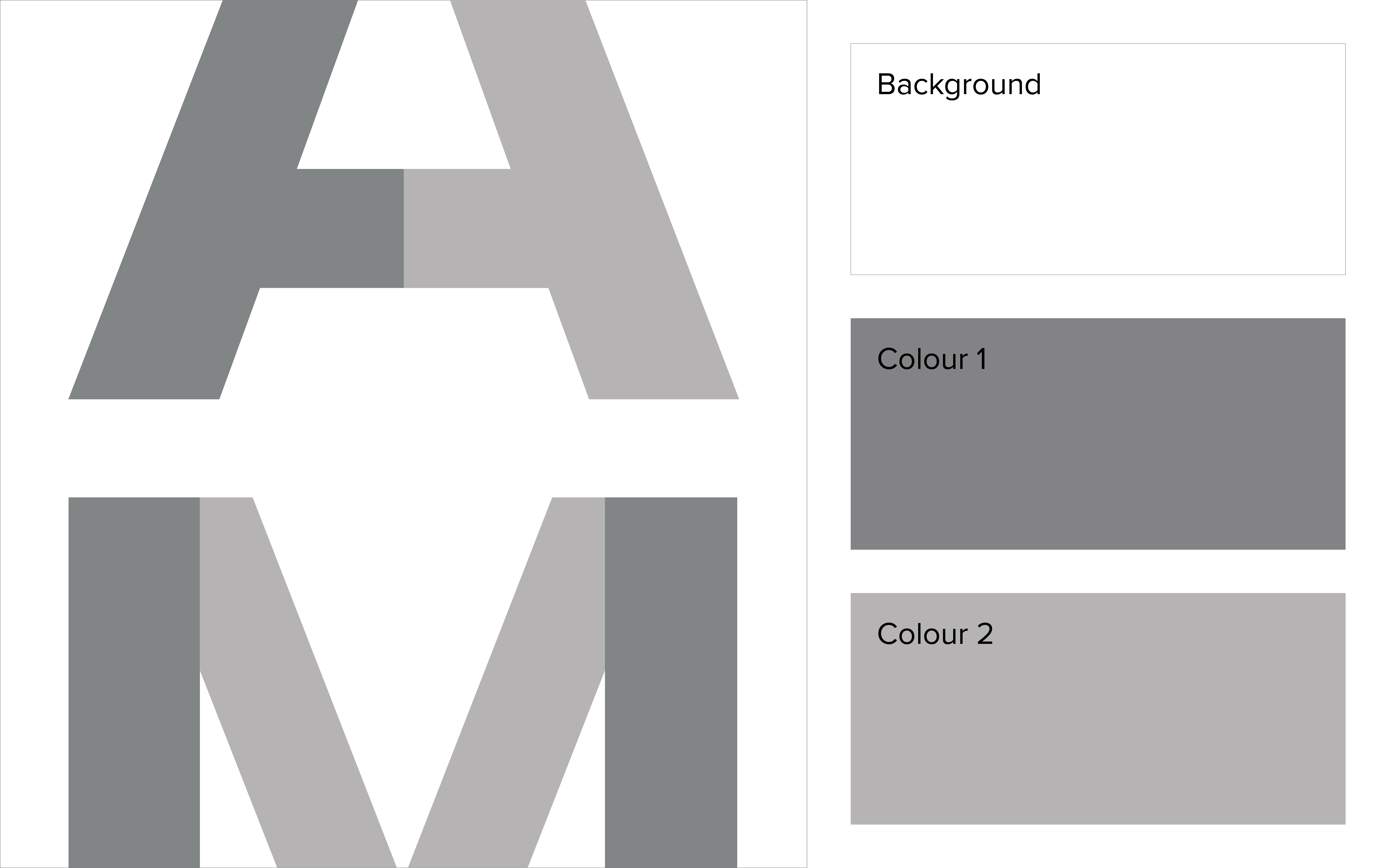
The intersection of letterforms within our wordmark show the explorative and observational nature of the Ara Manawa process where we ask — is this problem what it appears to be, and what is the best approach to building a solution?
The joins between letter pieces show harmonious alignment of challenges and expertise, effective connections between Auckland DHB, and between our patients, their whānau (family), and solutions.
The joins between letter pieces show harmonious alignment of challenges and expertise, effective connections between Auckland DHB, and between our patients, their whānau (family), and solutions.


Our team within the hopsital offers multidisciplinary design expertise to the complex organisation of the Auckland District Health Board. Our brand needed to be perceived as a credible design authority within an organisation with overall low design literacy.
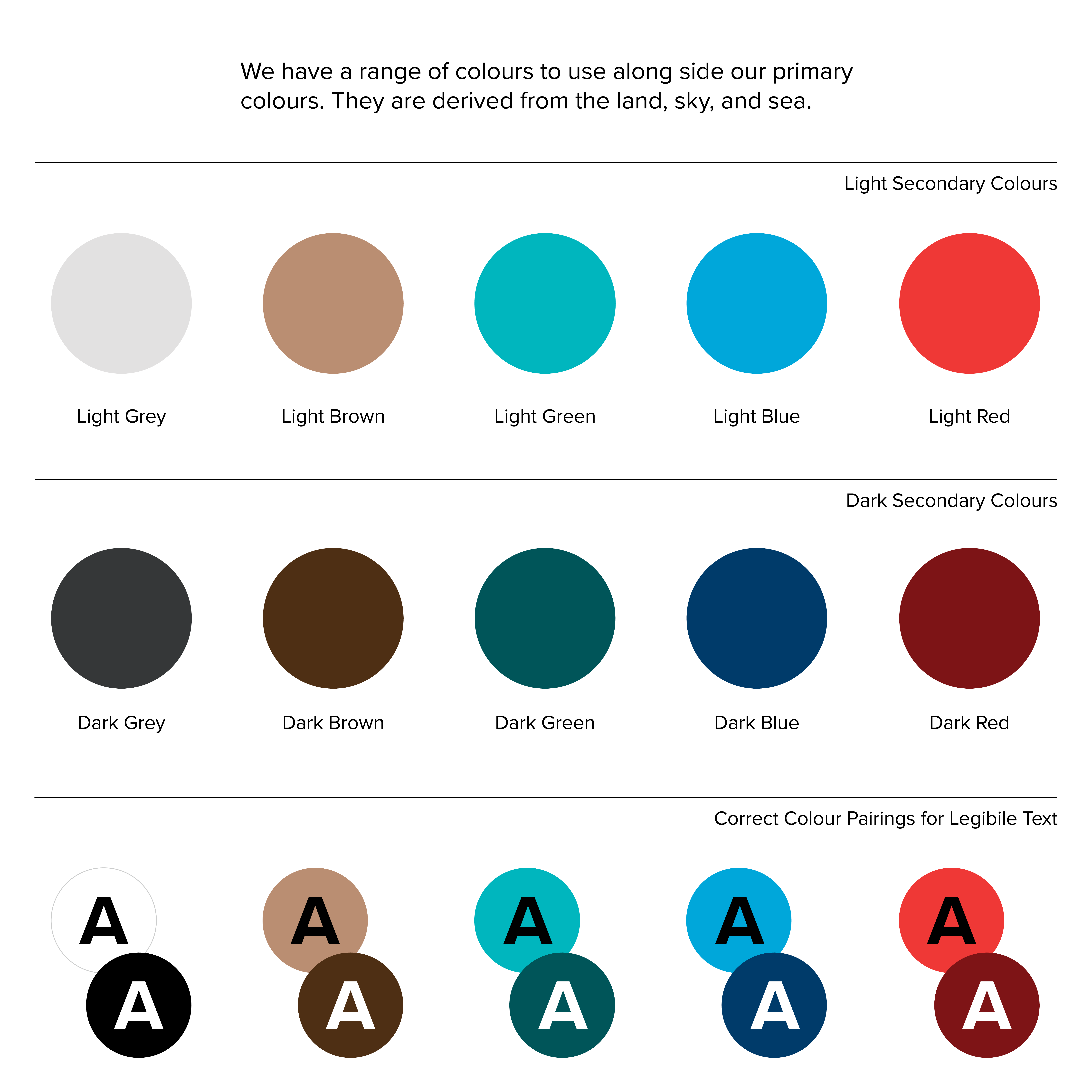
So I revised the colour palette to include energetic jewel tones with muted counterparts. This allowed us to convey that our forward, design thinking is grounded in research and exploration.
So I revised the colour palette to include energetic jewel tones with muted counterparts. This allowed us to convey that our forward, design thinking is grounded in research and exploration.
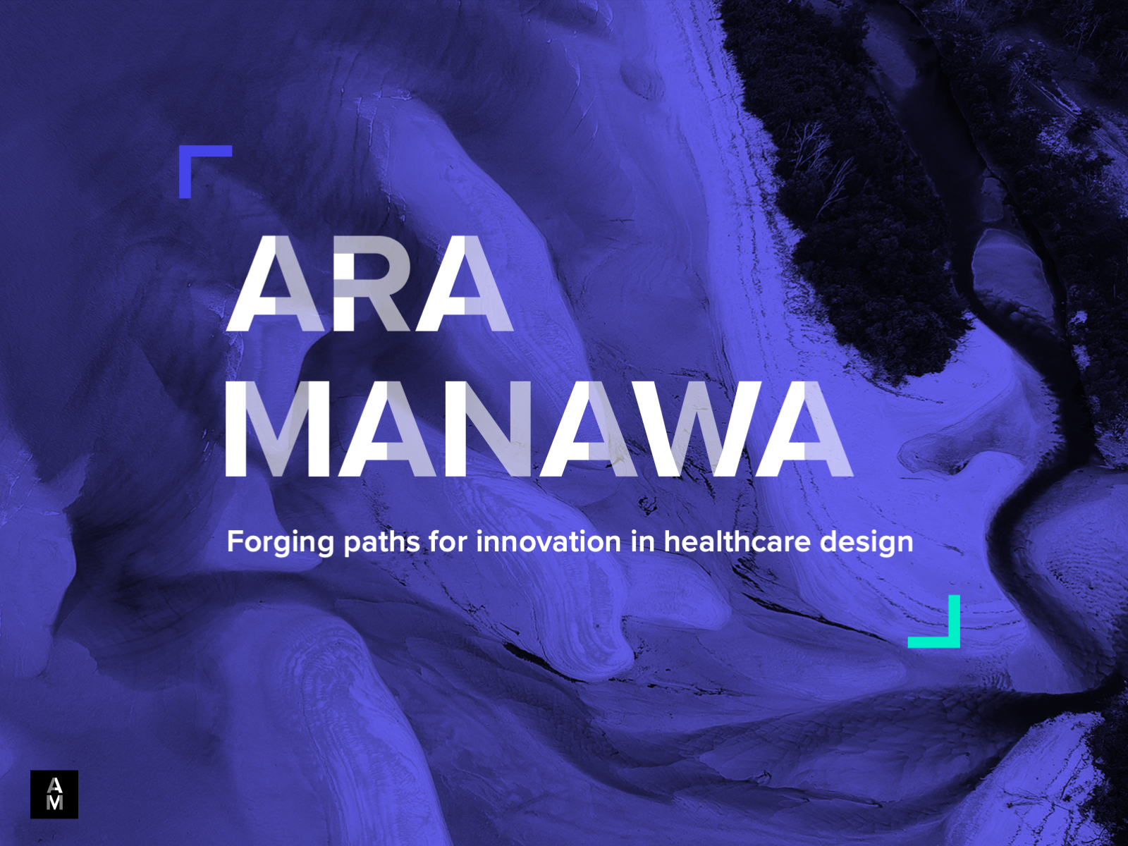
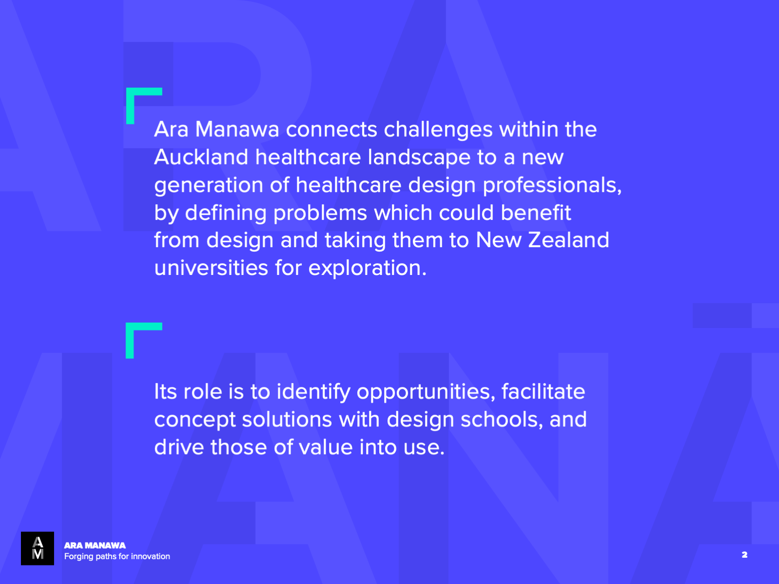
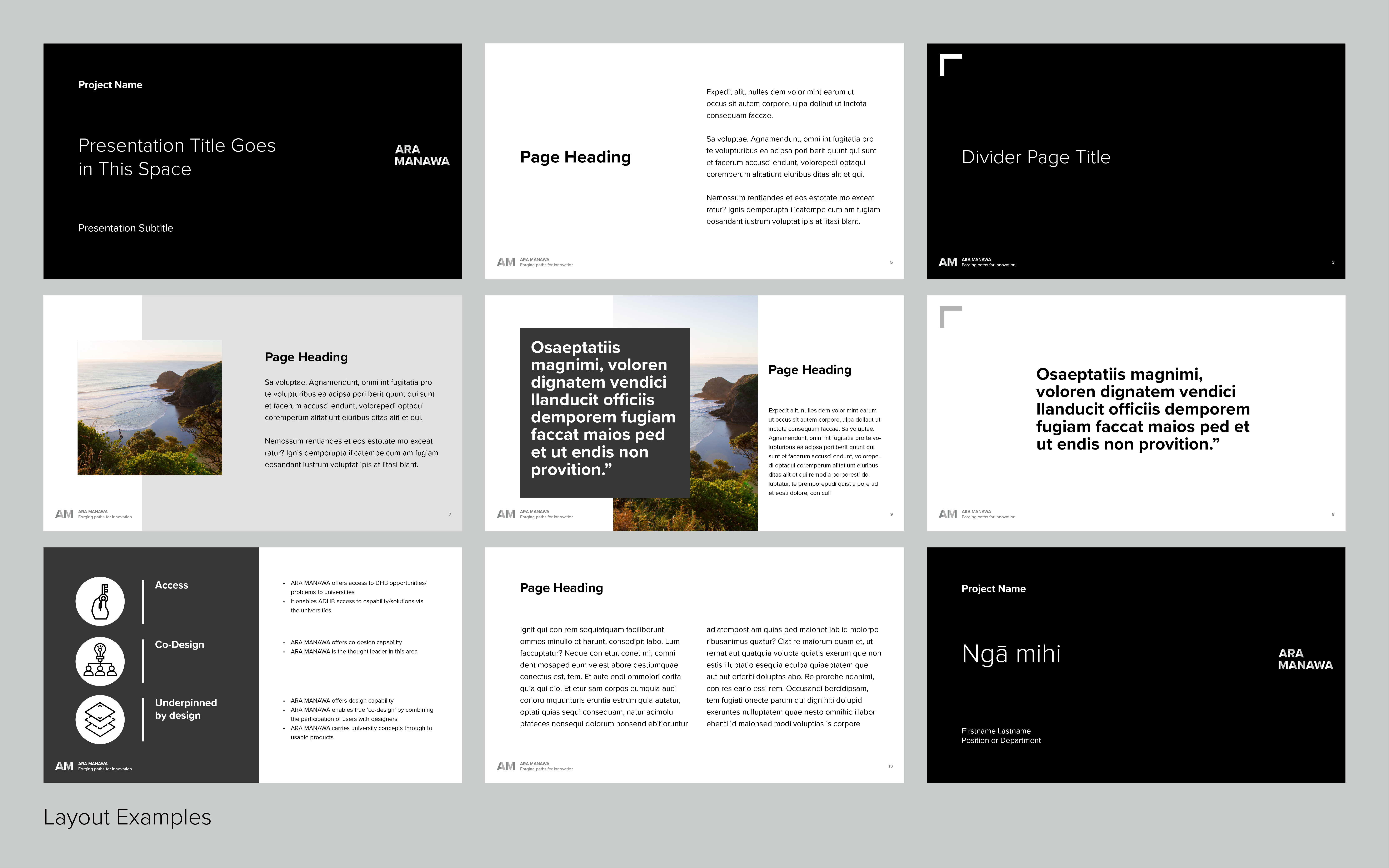
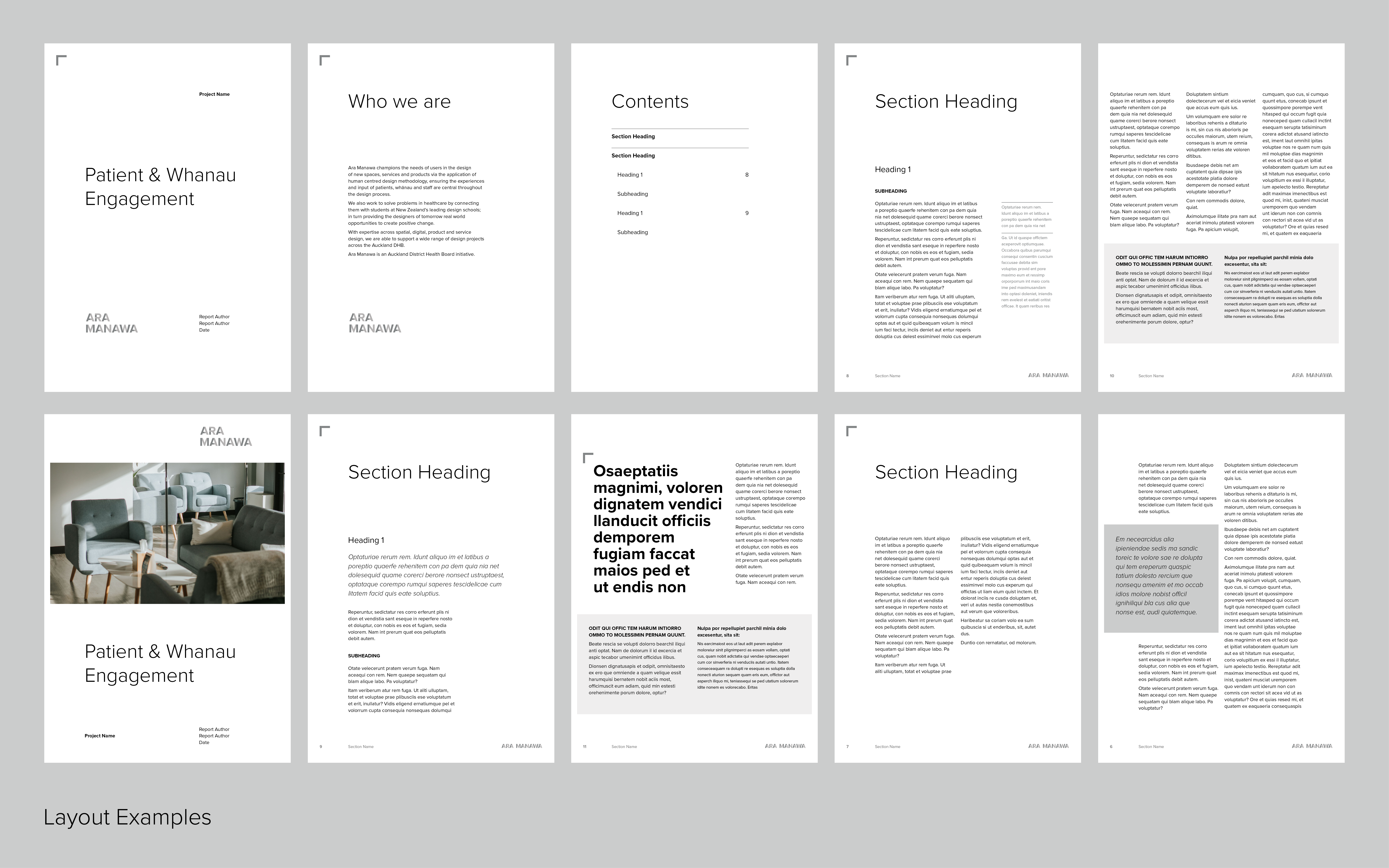
Ara Manwa’s layouts are simple, geometric, and layered to reflect the logo’s modular design. It allows our work to be at the centre and not be overshadowed by branding.
I created a suite of collateral that is easy for the team to use. This included a letterhead, project briefing form, creative briefing form, client onboarding collateral, presentation template, branded report template, case study template, updated website and more.
I created a suite of collateral that is easy for the team to use. This included a letterhead, project briefing form, creative briefing form, client onboarding collateral, presentation template, branded report template, case study template, updated website and more.
︎ Linkedin ©2026 Jenna Hagan