Ara Manawa Brand
Auckland DHBAra Manawa is a innovation design studio embedded within the Auckland DHB. The team consists of designers from an array of disciplines as well as a qualitative researcher and co-designer.
I’m the visual designer within the studio. I arrived to the team just a few weeks before Covid-19 locked down New Zealand. Our newly established team, was barely a year old at that time.
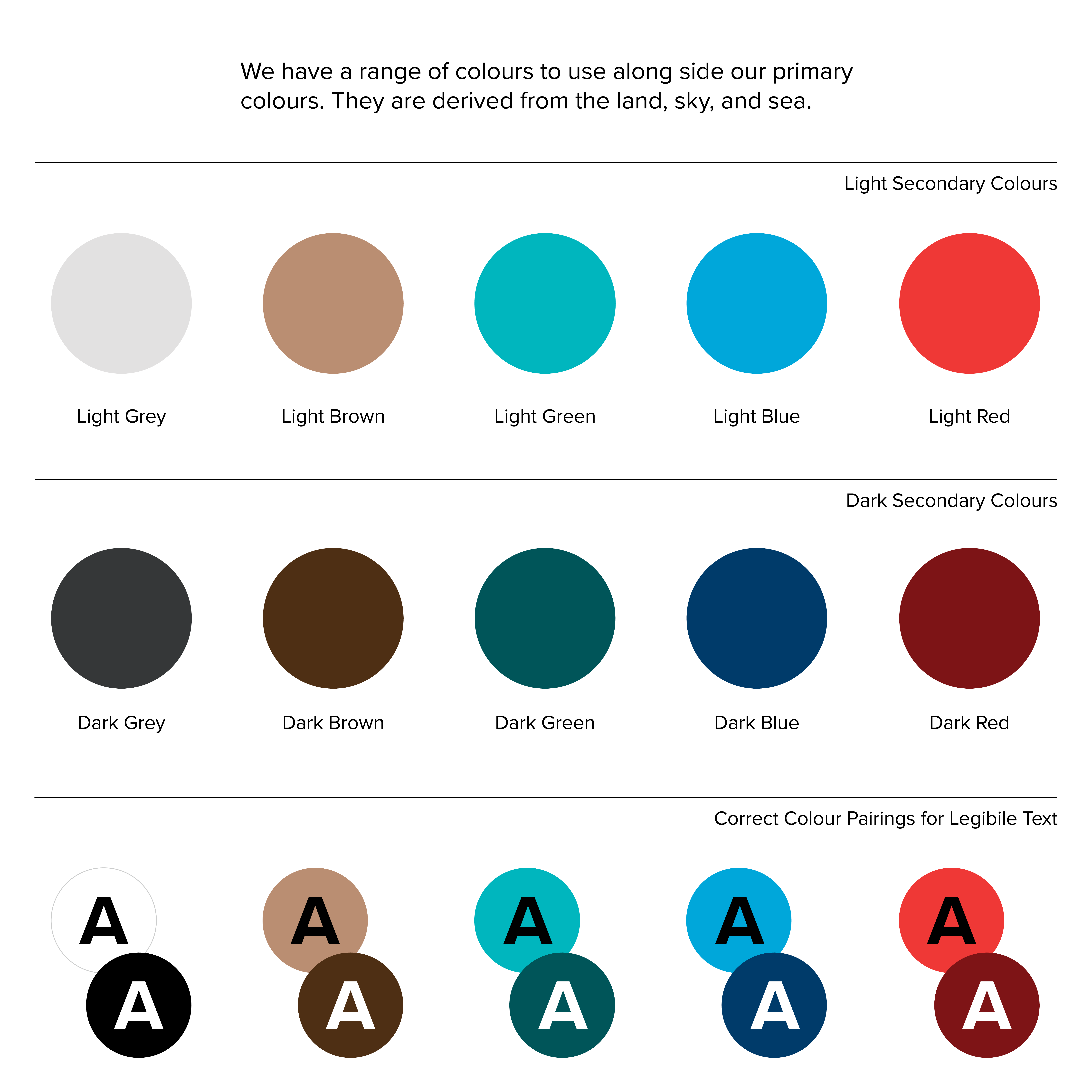
It had an existing logo, but the brand look and feel wasn’t quite on the mark, the brand collateral was non-existent. I refined the logo colours so they work on the secondary colour palette I created.
I’m the visual designer within the studio. I arrived to the team just a few weeks before Covid-19 locked down New Zealand. Our newly established team, was barely a year old at that time.
It had an existing logo, but the brand look and feel wasn’t quite on the mark, the brand collateral was non-existent. I refined the logo colours so they work on the secondary colour palette I created.
- Branding
- Logo refinement
- Colour
- Layout

The intersection of letterforms within our wordmark show the explorative and observational nature of the Ara Manawa process where we ask — is this problem what it appears to be, and what is the best approach to building a solution?
The joins between letter pieces show harmonious alignment of challenges and expertise, effective connections between Auckland DHB, and between our patients, their whānau (family), and solutions.
The joins between letter pieces show harmonious alignment of challenges and expertise, effective connections between Auckland DHB, and between our patients, their whānau (family), and solutions.

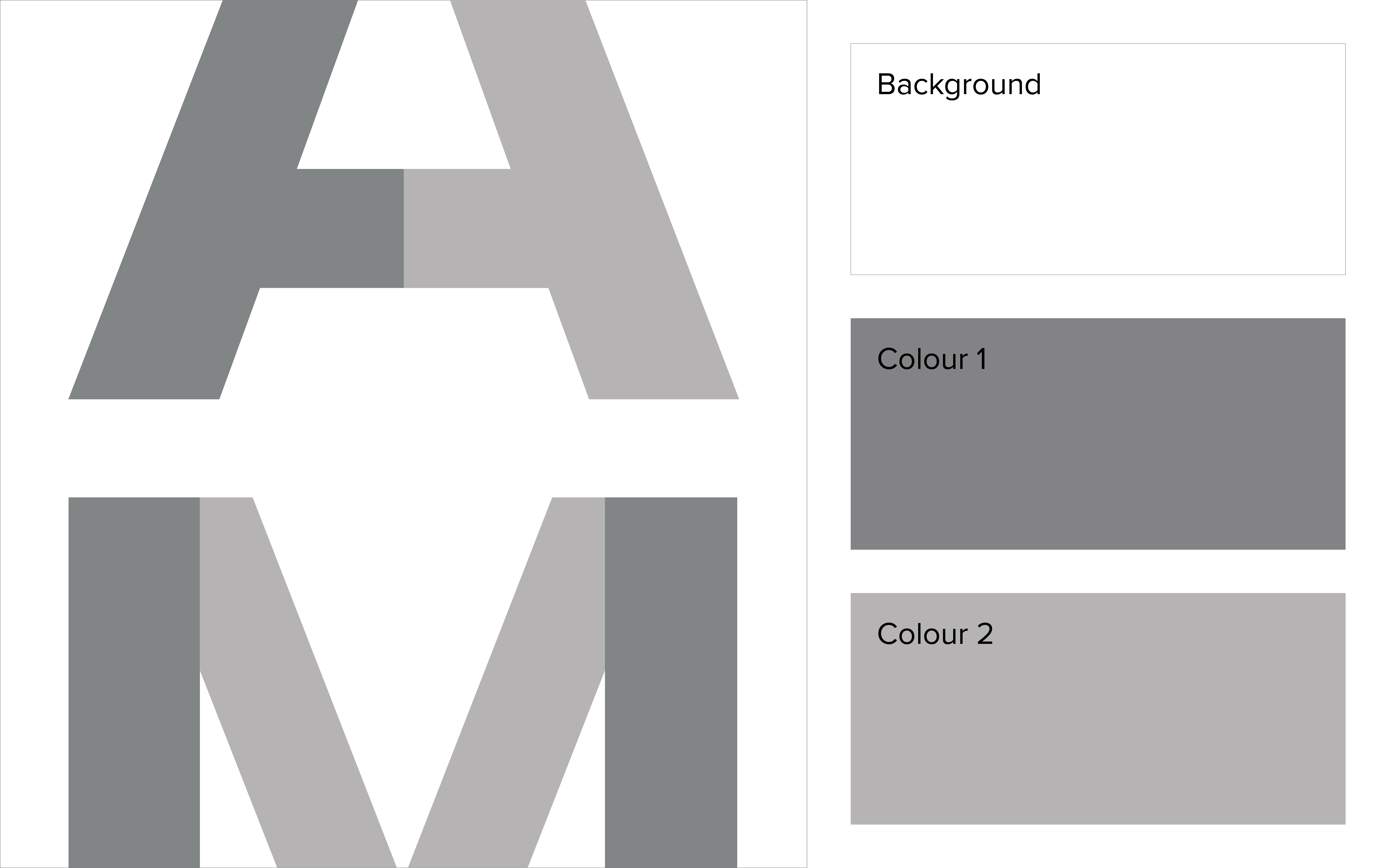

Our team within the hopsital offers multidisciplinary design expertise to the complex organisation of the Auckland District Health Board. Our brand needed to be perceived as a credible design authority within an organisation with overall low design literacy.
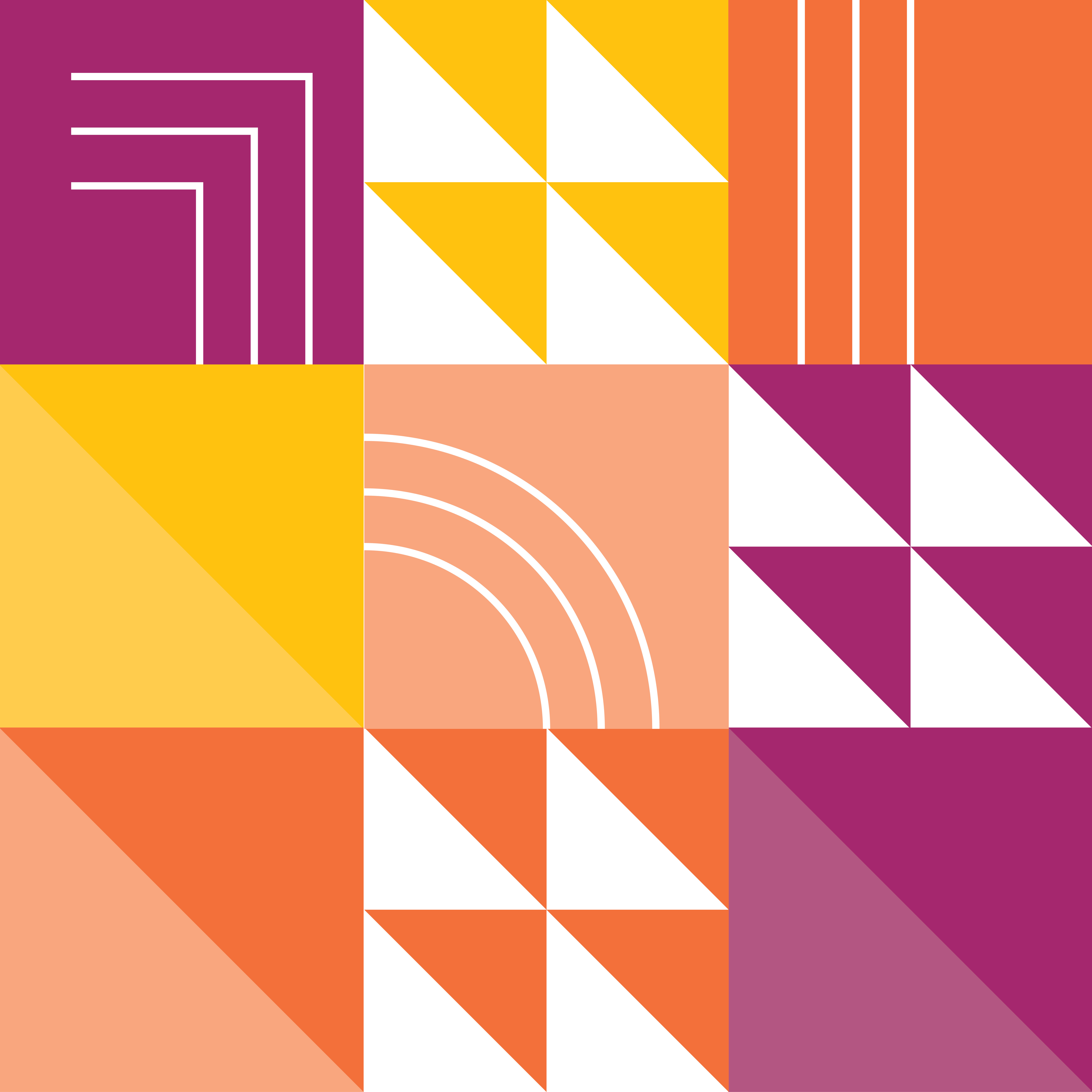
So I revised the colour palette to include energetic jewel tones with muted counterparts. This allowed us to convey that our forward, design thinking is grounded in research and exploration.
So I revised the colour palette to include energetic jewel tones with muted counterparts. This allowed us to convey that our forward, design thinking is grounded in research and exploration.
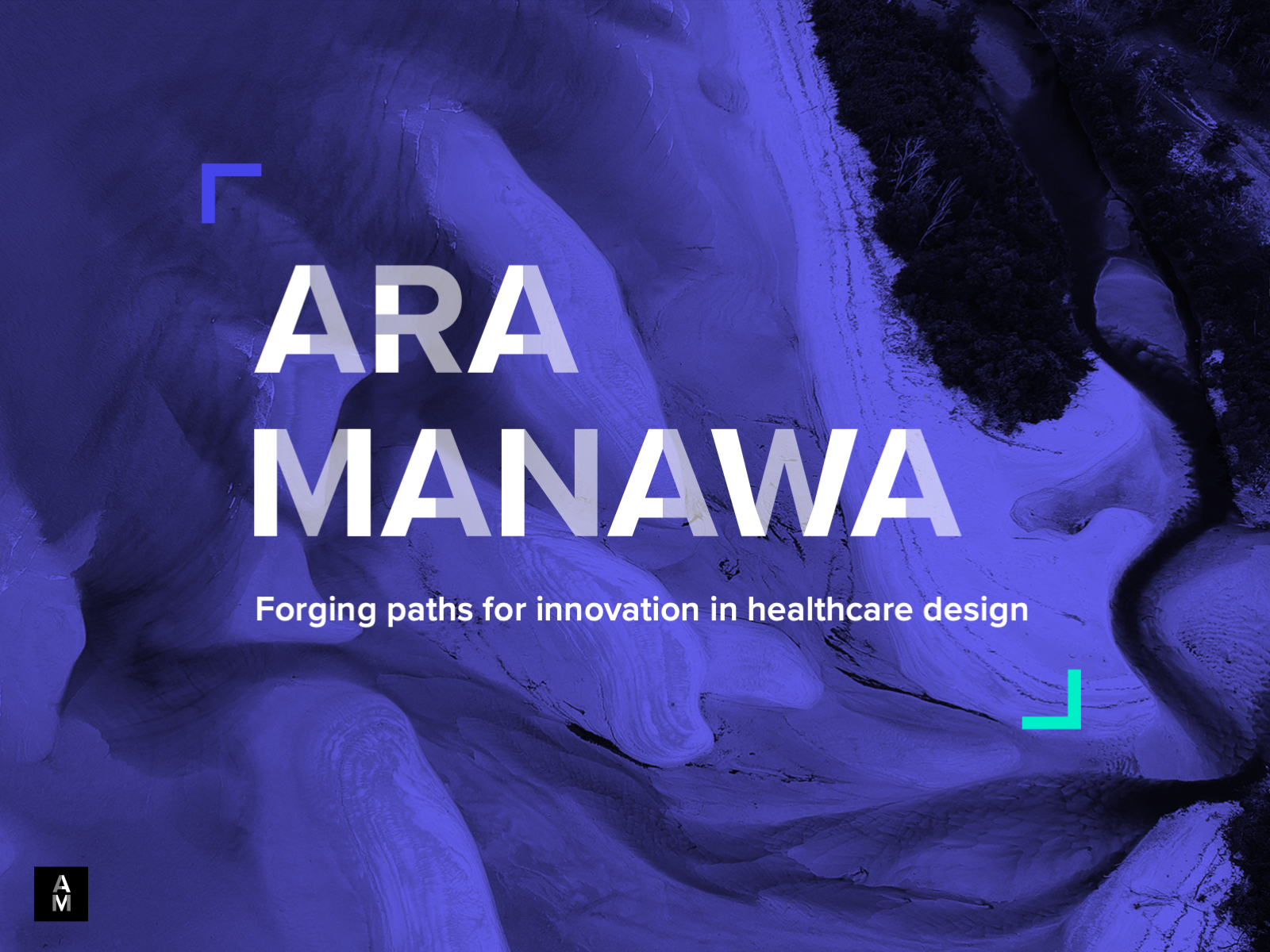
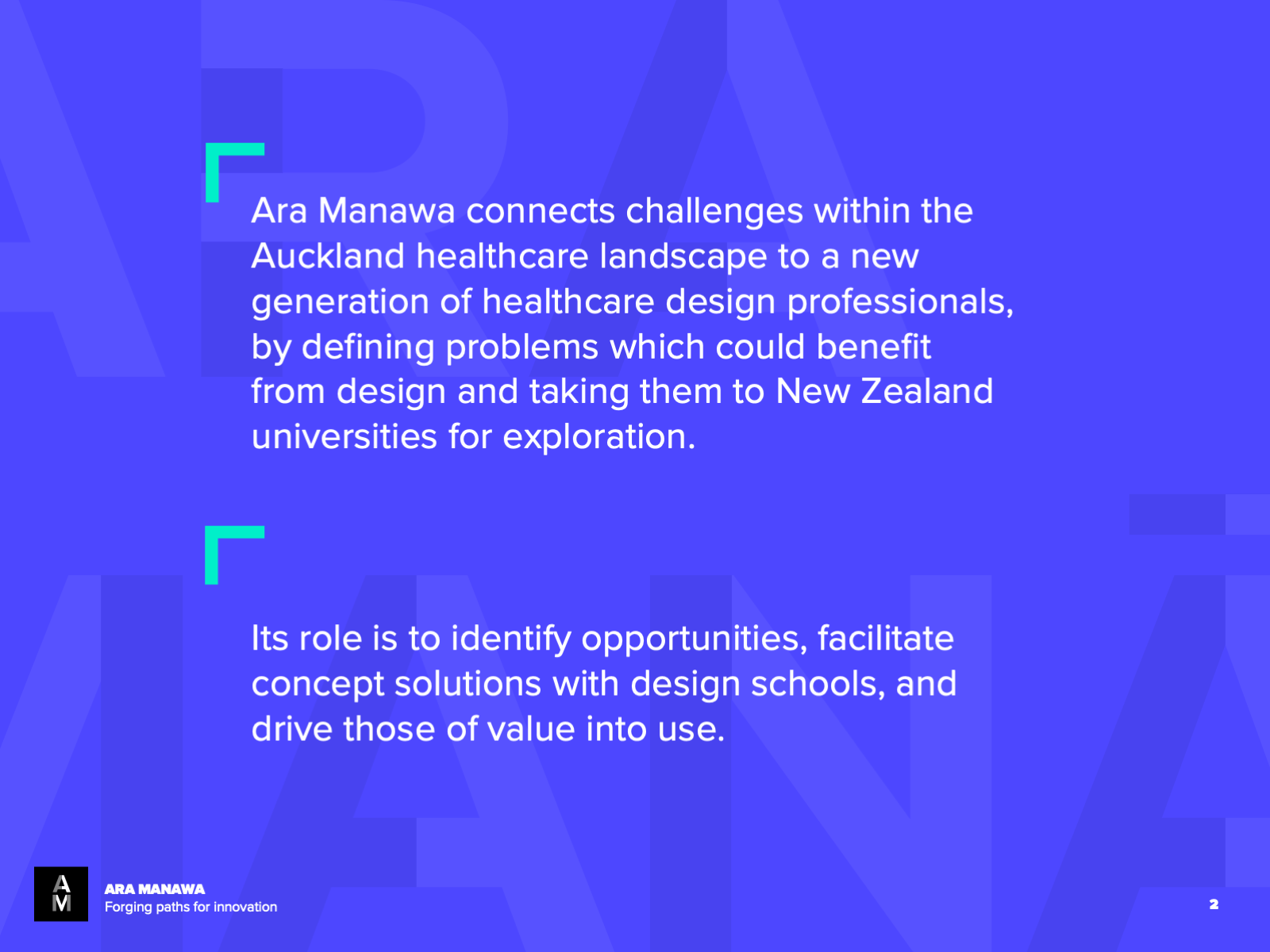
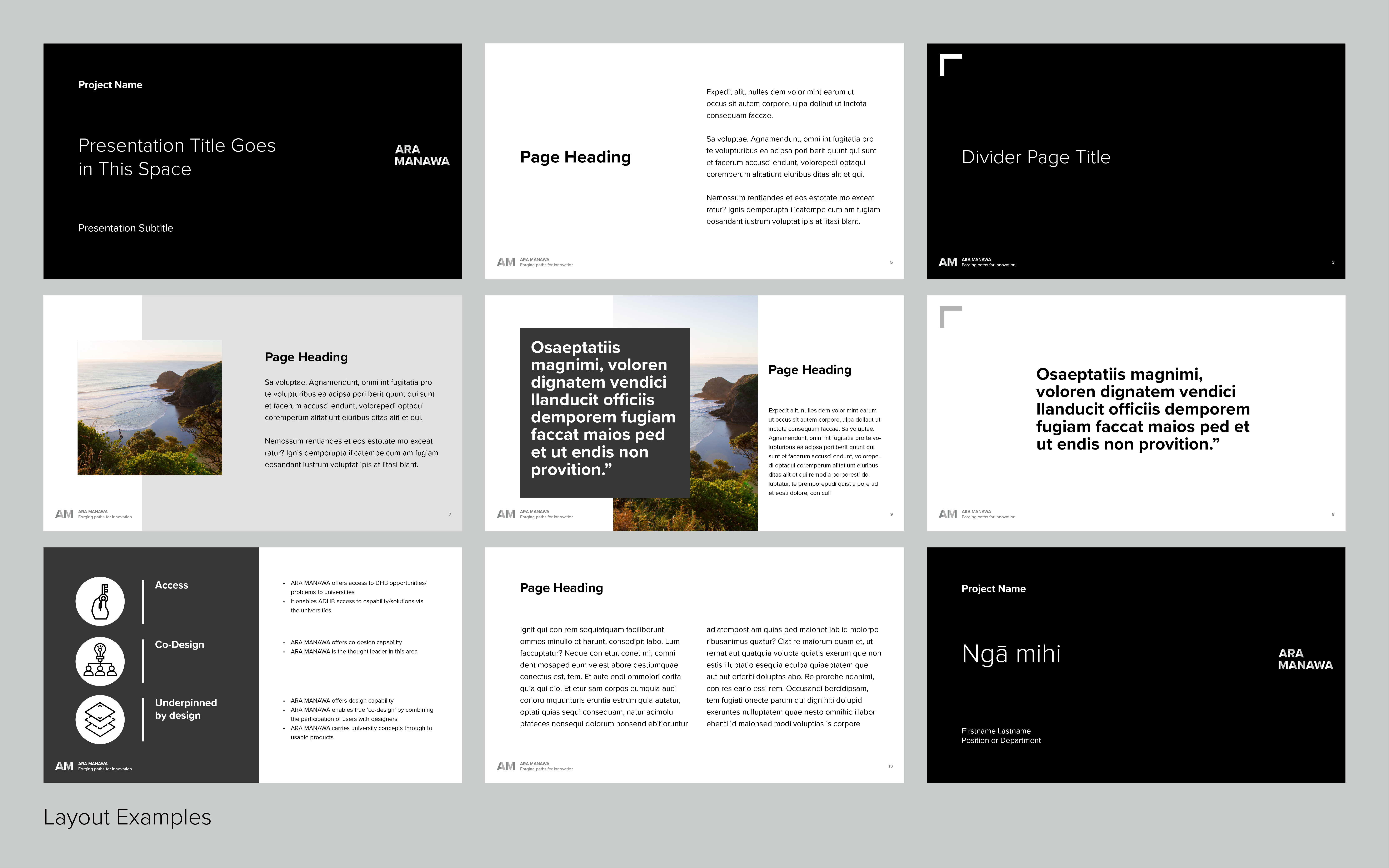
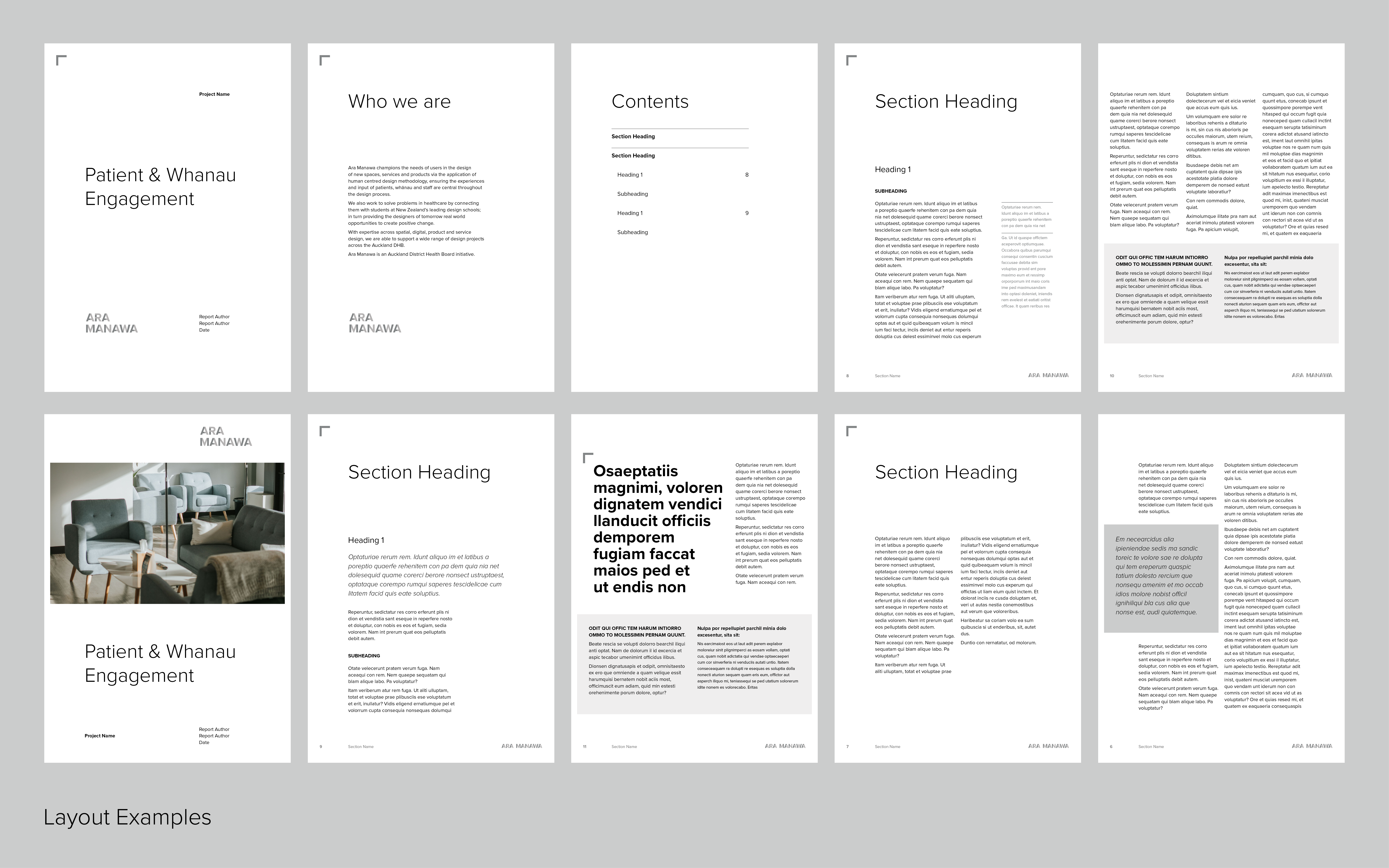
Ara Manwa’s layouts are simple, geometric, and layered to reflect the logo’s modular design. It allows our work to be at the centre and not be overshadowed by branding.
I created a suite of collateral that is easy for the team to use. This included a letterhead, project briefing form, creative briefing form, client onboarding collateral, presentation template, branded report template, case study template, updated website and more.
I created a suite of collateral that is easy for the team to use. This included a letterhead, project briefing form, creative briefing form, client onboarding collateral, presentation template, branded report template, case study template, updated website and more.
Whānau Room Rejuvenation
Auckland DHBSome design work asks you to make things look good. This work asked something more, to make people feel safe.
The Whānau Rooms at Te Toka Tumai Auckland Hospital exist to honour te ao Māori and the tikanga that surrounds illness, death, and grief. When a loved one passes in a four-bedded ward, these are the spaces where whānau can gather, process, and be together. As the first hospital in the world to house dedicated Māori whānau spaces, the rejuvenation of these rooms carried real cultural and human weight.
This project was grounded in te ao Māori and the principles of tikanga, designing in service of whanaungatanga, manaakitanga, and the obligations of a hospital built on land gifted by Ngāti Whātua. Every design decision was made in service of that kaupapa.
The Storybook
Ara Manawa's co-design process generated years of research, insight, and human story. My role was to help the team understand how that work could be translated into a visual format, and then to design it.
- Layout
- Typography
- Murals
- Internal spaces
- Print Production

The result was a 40-page storybook documenting the full rejuvenation programme: its history, its co-design process, its design decisions, and the voices of the whānau, patients, and staff who shaped it. Layout, typography, colour, and visual hierarchy were all considered in service of the story, making complex, emotionally significant content accessible, warm, and readable.
Each ward was gifted a few copies of the storybook to place in the Whānau Room’s themselves.
![]()
![]()
![]()
![]()
![]()
![]()
![]()
Environmental Artwork & Mural Installation
I led the adaptation and installation of the Paatu Maioha, the welcome mural designed by Matekitātahi Rāwiri-McDonald of TOA Architects, across the exterior walls of every rejuvenated Whānau Room. This involved translating the artwork into large-format print, fitting it to varied architectural environments across multiple wards, and overseeing its installation to ensure the integrity of the design was maintained at scale.
![]()
![]()
![]()
![]()
I also oversaw the internal landscape murals, large photographic nature scenes selected to bring a sense of the outside world into rooms with no natural light, responding directly to what whānau had told us they needed most.
Co-Design Collateral
Throughout the programme I created visual materials to support the spatial and co-design process, workshop materials, concept boards, and visual aids that helped non-designers engage meaningfully with design decisions. Good co-design needs good visual communication, and this work sat at that intersection.
Each ward was gifted a few copies of the storybook to place in the Whānau Room’s themselves.


Environmental Artwork & Mural Installation
I led the adaptation and installation of the Paatu Maioha, the welcome mural designed by Matekitātahi Rāwiri-McDonald of TOA Architects, across the exterior walls of every rejuvenated Whānau Room. This involved translating the artwork into large-format print, fitting it to varied architectural environments across multiple wards, and overseeing its installation to ensure the integrity of the design was maintained at scale.


I also oversaw the internal landscape murals, large photographic nature scenes selected to bring a sense of the outside world into rooms with no natural light, responding directly to what whānau had told us they needed most.
Co-Design Collateral
Throughout the programme I created visual materials to support the spatial and co-design process, workshop materials, concept boards, and visual aids that helped non-designers engage meaningfully with design decisions. Good co-design needs good visual communication, and this work sat at that intersection.
Studio 160 Identity
Auckland DHBStudio 160 is a co-op working space within Health New Zealand Te Toka Tumai (formerly Auckland DHB). Established in 2019, it has developed into a bustling office with a bookable workshop (The Apartment) and maker space. Currently it’s home to Ara Manawa, Performance Improvement, EPMO, Strategy, QSR, Data & Digital with others joining soon.
The Studio identity is a representation of the collaborative nature of the teams at 160. The overarching goal of all the teams in our studio is to enhance the experience for patients, whānau and staff at Te Toka Tumai. Each team is responsible for creating and upholding a space that is welcoming and respectful, which are ADHB values.
When I joined Ara Manawa, our space was and still is a work in progress. My first task was to develop an identity for Studio 160, update collateral and develop the visual-spatial experience. The development of this identity is iterative and explorative, which means as time goes on it will continue to adapt to the needs of the Studio and be open to collaborative-design-development.
- Logo
- Colour Palette
- Visual Motif
- Meeting Room Glass
- Wayfinding
- Community Wall
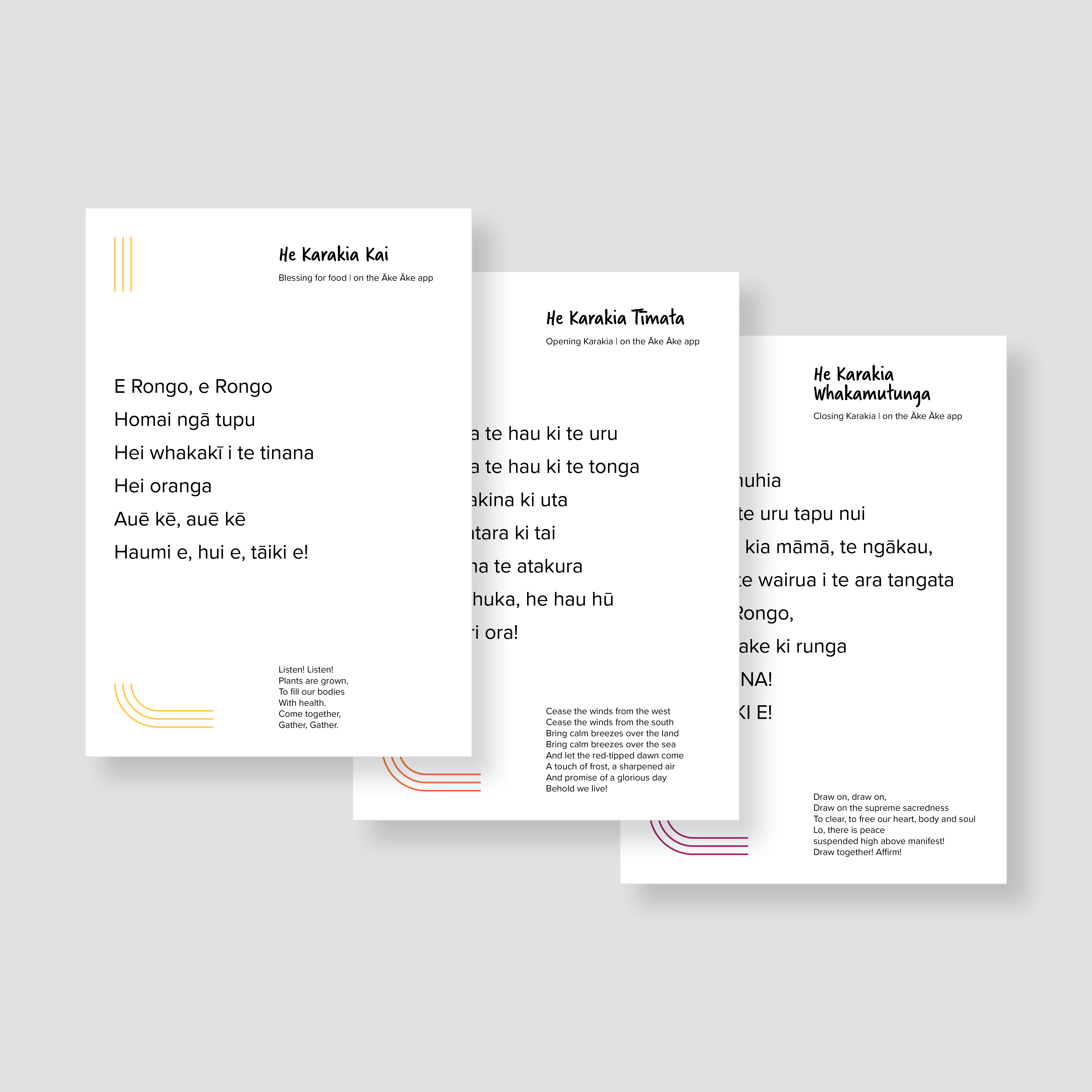
- Karakia Cards


Scalable Clinical Pathways Design System
Auckland DHBClinical pathways are evidence-based guides that help clinicians deliver consistent care. The challenge: existing pathways across Starship Hospital varied widely in format, had no visual consistency, and had to be rebuilt from scratch each time. I was approached to design a system that would fix that.
I led the design work end to end — researching best practice, auditing existing formats, prototyping with clinicians, and delivering a modular design kit and comprehensive style guide aligned with Starship’s existing brand that the Clinical Pathways team could own and use independently long-term.
I led the design work end to end — researching best practice, auditing existing formats, prototyping with clinicians, and delivering a modular design kit and comprehensive style guide aligned with Starship’s existing brand that the Clinical Pathways team could own and use independently long-term.
- Design system
- Templates
- Layout
- Typography
- Colour
- Brand-alignment

The system
The visual design system included typography rules, colour application, layout templates, hierarchy guidelines, and usage documentation. It was built to be adopted by non-designers, applied consistently across departments, and scaled without needing a designer in the room every time.
The visual design system included typography rules, colour application, layout templates, hierarchy guidelines, and usage documentation. It was built to be adopted by non-designers, applied consistently across departments, and scaled without needing a designer in the room every time.

Outcomes
A reusable system that reduced cognitive load for clinicians, improved pathway consistency across services, and gave Starship's team the tools to maintain and extend it independently.
A reusable system that reduced cognitive load for clinicians, improved pathway consistency across services, and gave Starship's team the tools to maintain and extend it independently.
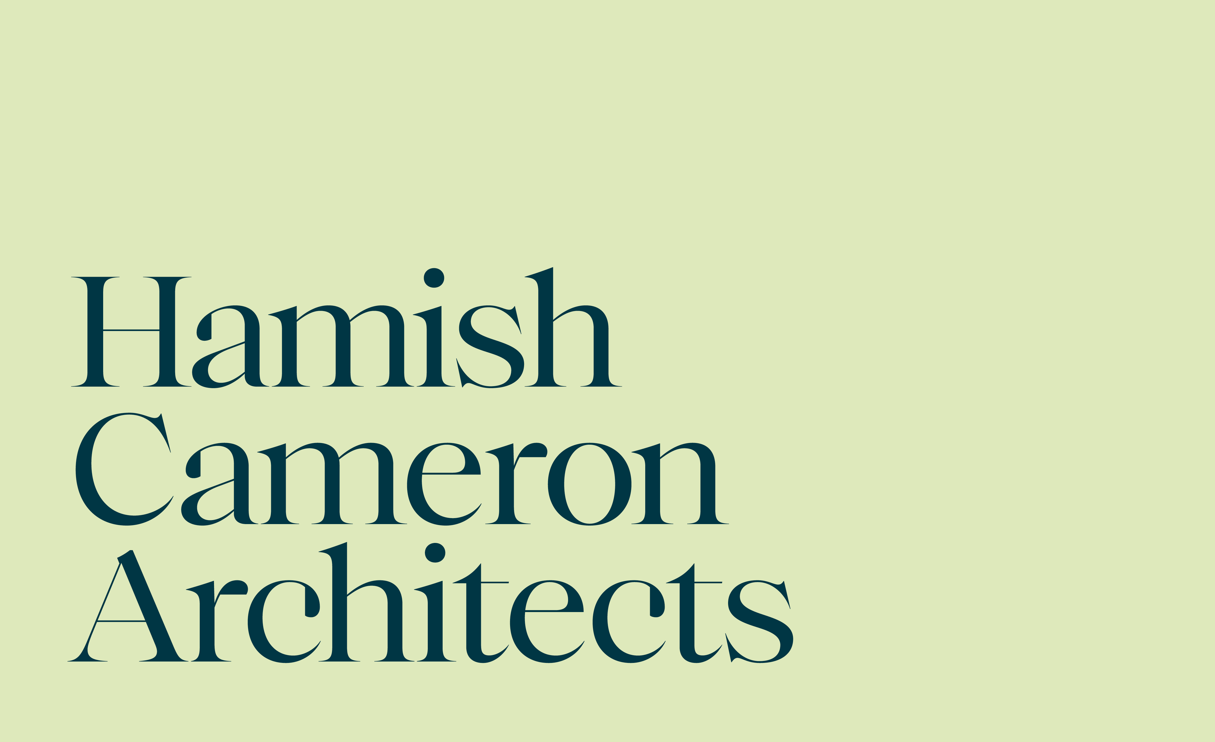
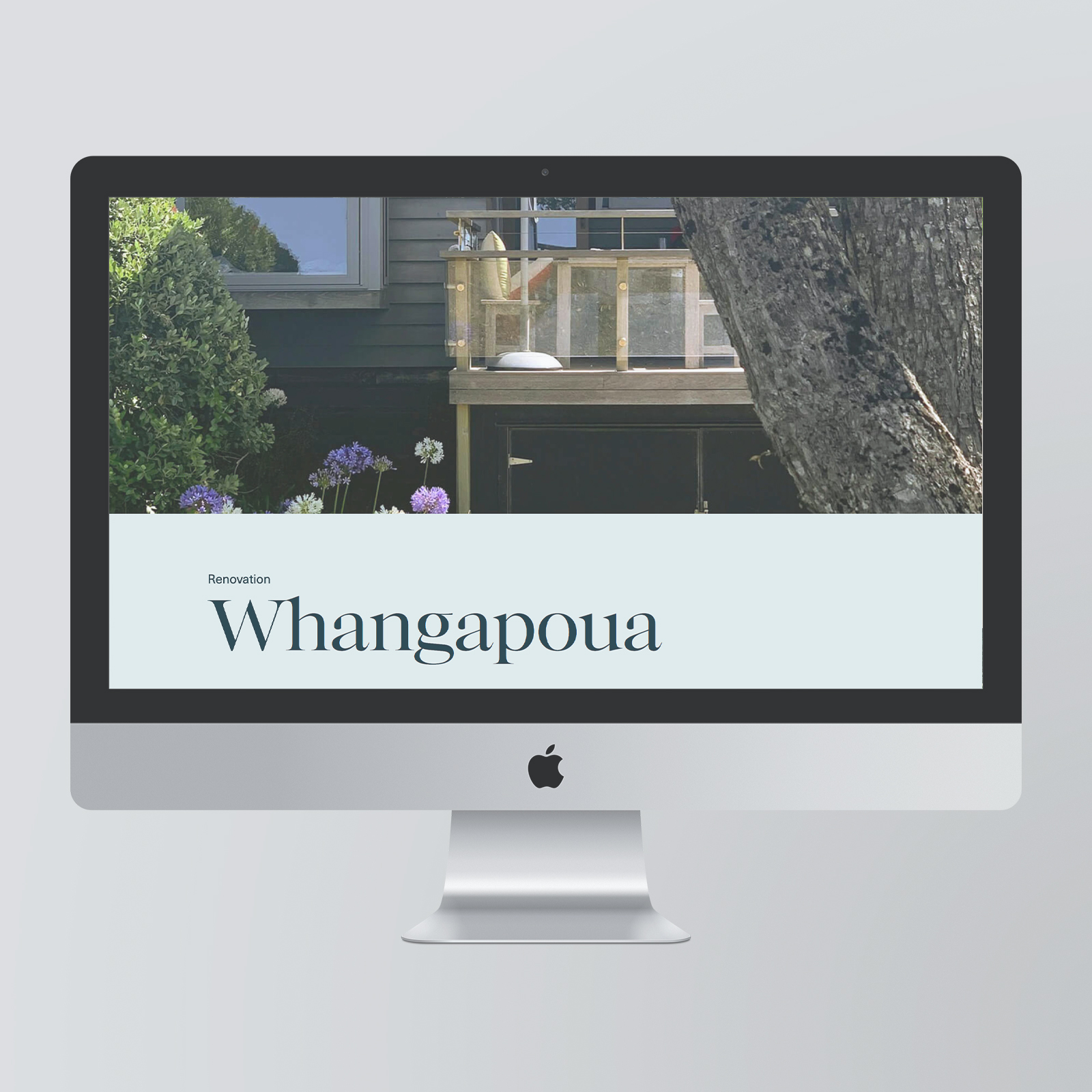
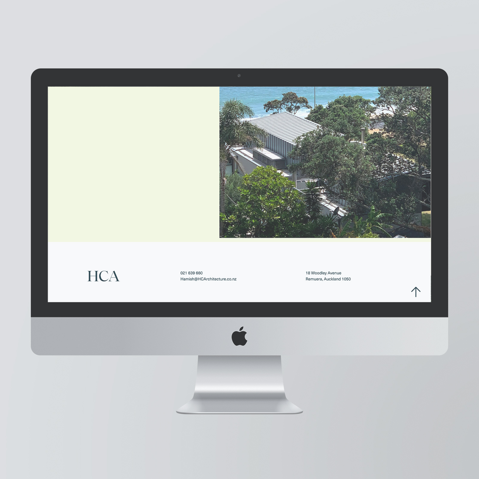
HC Architects Brand & Website
HeyYou StudioHamish Cameron Architects is a small New Zealand firm that really focuses on the details of a home. They draw from natural materials and surroundings to inform their design process. For HCA, I designed a logo, monogram, and brand colours which all culminated into the website and basic brand collateral.
The colours are soft and muted to support the mood of HCA’s work. The wordmark is traditional with subtle modern cues and fine details that reflect HCA’s work.
The colours are soft and muted to support the mood of HCA’s work. The wordmark is traditional with subtle modern cues and fine details that reflect HCA’s work.
- Branding
- Logo
- Colour
- Web Design
- Layout
“
We craft buildings and spaces with quiet atmosphere and soul that reflect the unique character of their owners and bring calm and a sense of well-being to their lives.
hcarchitecture.co.nz/


︎ Linkedin ©2026 Jenna Hagan